The Big Event! Offers on Paint, Flooring, Doors & more
Skip to content Skip to navigation menu
Basket
0
style-shelf-header.jpg

Shelves are often meant for function above all else, but that doesn’t mean they have to look messy. We’ve got some top tips for making your shelves look the part, whether you’re using them for storage, aesthetics, or both!

style-shelf-blank-slate.jpg
Start with a blank slate

When redesigning a space, it’s always best to start with a blank canvas. Take everything that you want to put on your shelf and place it on a table or on the floor where you can easily see it all. This means you can start with larger or more important items and build your shelf design around that.

style-shelf-clusterlayerbalance.jpg
Cluster. Layer. Balance.

When it comes to arranging your items, it’s much better if everything looks natural and authentic. Yes, the act of trying to make something look natural does sound a bit contradictory, but there are a few techniques you can use that work together to achieve this:

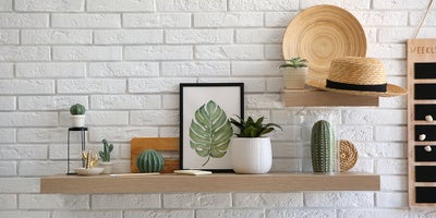
Cluster: Grouping objects together can help to create focal points across your shelves. You’ll get the best look by mixing textures and sizes within a group so it doesn’t all feel too uniform. For example, placing a smooth ceramic vase next to a wicker basket can create a lot of textural interest and help to achieve a varied look.

style-shelf-balance.jpg

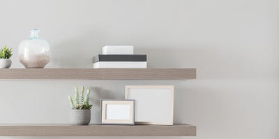
Layer: A shelf filled with items that are all the same height and depth can end up looking a bit boring and uninspired. This is why it’s great to choose objects and trinkets that all have vastly different sizes. Place the larger items at the back, like an A4 print in an ornate frame or a large potted plant, and layer smaller objects in front of it like candles or trinket bowls. You can also use books to help add height to your shelf by lying them flat to create a platform for something else to sit on top of.

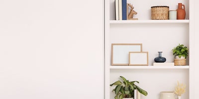
Balance: Even if you do have a variety of shapes and sizes, you don’t want to put everything small on the top and everything large on the bottom. You also don’t want the large objects all slap-bang in the middle of each shelf as that would look unnatural. Your shelves will look best if you spread these objects around, and the best way to do this is by arranging them in a zig-zag shape running from the top to the bottom.
style-shelf-practical.jpg
Keep it practical

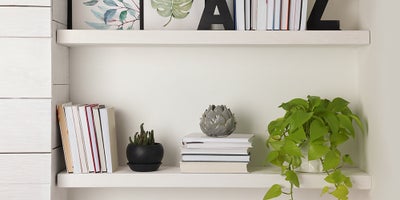
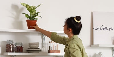
If your shelf is more of a functional one, remember not to let style take over from practicality. For example, a bookshelf that you use a lot will probably benefit from being ordered alphabetically so it’s easy to find what you’re looking for. For a more decorative bookshelf, you can go wild with colour order, size order, or even have the spines facing the wall for a more neutral look (beware however as this can be a controversial decision!). You also need to keep in mind that certain objects may have more of a function than others, so you’ll need access to them. This means that candles should be within reach, and plants that need watering often should be easy to take down and care for when the time comes.

style-shelf-personal.jpg
Add a personal touch

Home isn’t home without a few personal touches, and your shelves are the best place to include these treasured heirlooms and memories. Whether you decide to display family pictures or generational hand-me-downs, make sure to prioritise these over other design elements as they help to bring soul to your interior. Another growing trend is in handmade arts and crafts, so anything you can make yourself - whether it be a crocheted cactus or a hand-painted plate – can add a little bit of you to your décor.

style-shelf-stepback.jpg
Step back and make changes

Once you’ve finished styling your items, make sure to step back and take a good look at your arrangement. You won’t always be standing directly in front of the shelf, so it’s good to take in views from around the room. This is when you can gauge whether each component feels like it fits where you’ve put it, and if not, make a few tweaks until it looks just right. It may take a lot of trial and error, but it will be worth it in the end.